The DUOLIFE website, now freshly redesigned, represents a significant transformation from its previous non-user-friendly platform into a modern, intuitive space that greatly enhances the shopping experience. This redesign aligns with DUOLIFE's broader brand evolution, embracing simplicity, innovation, and user-centered design principles to better serve health-conscious customers seeking natural supplements and skincare products.
This project also included designing a comprehensive, information‑rich dashboard for club members, enabling them to manage their sales, monitor performance, track commissions, and review customer activity in one place.
User Testing
User testing for the redesigned DUOLIFE platform was carefully prepared and conducted by myself, with a strong focus on evaluating the prototype’s crucial functionalities, especially the shopping customer journey and the club member zone features.
In this process, I tested 13 club members representing diverse levels of engagement with the website. This mix included new users, moderately active members, and highly engaged club participants, which provided a comprehensive understanding of usability across different user profiles. I guided each participant through typical tasks such as browsing and purchasing products in the shop, managing their personal data, accessing financial information, and exploring their network structure within the club zone.
What went good
I am especially proud of this accomplishment because, at first, I faced resistance and lack of support for the idea of user testing. Overcoming that initial skepticism to demonstrate the value of authentic user feedback and applying it to improve the platform was a significant achievement that reinforced the importance of user-centered design and perseverance.
Preparations
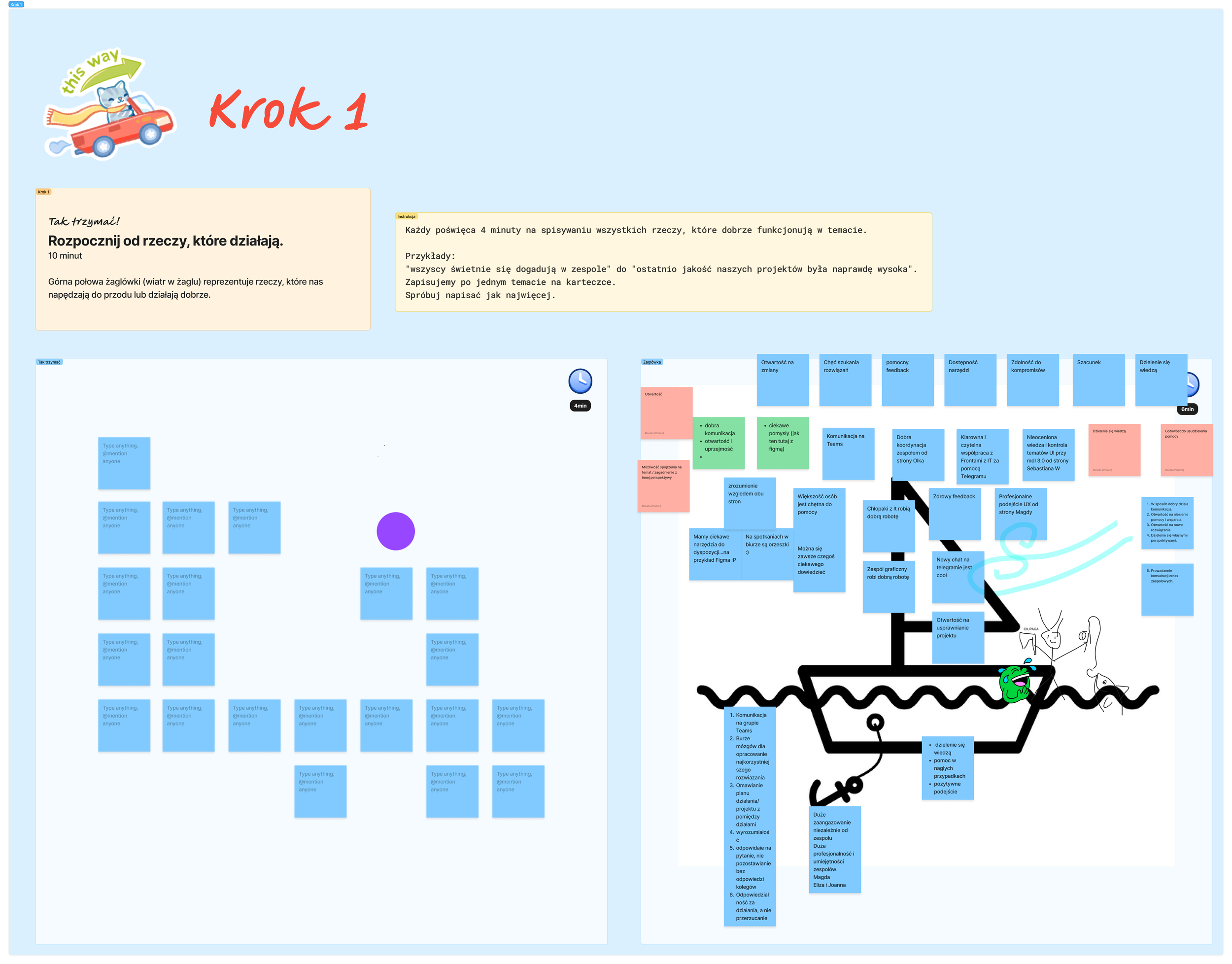
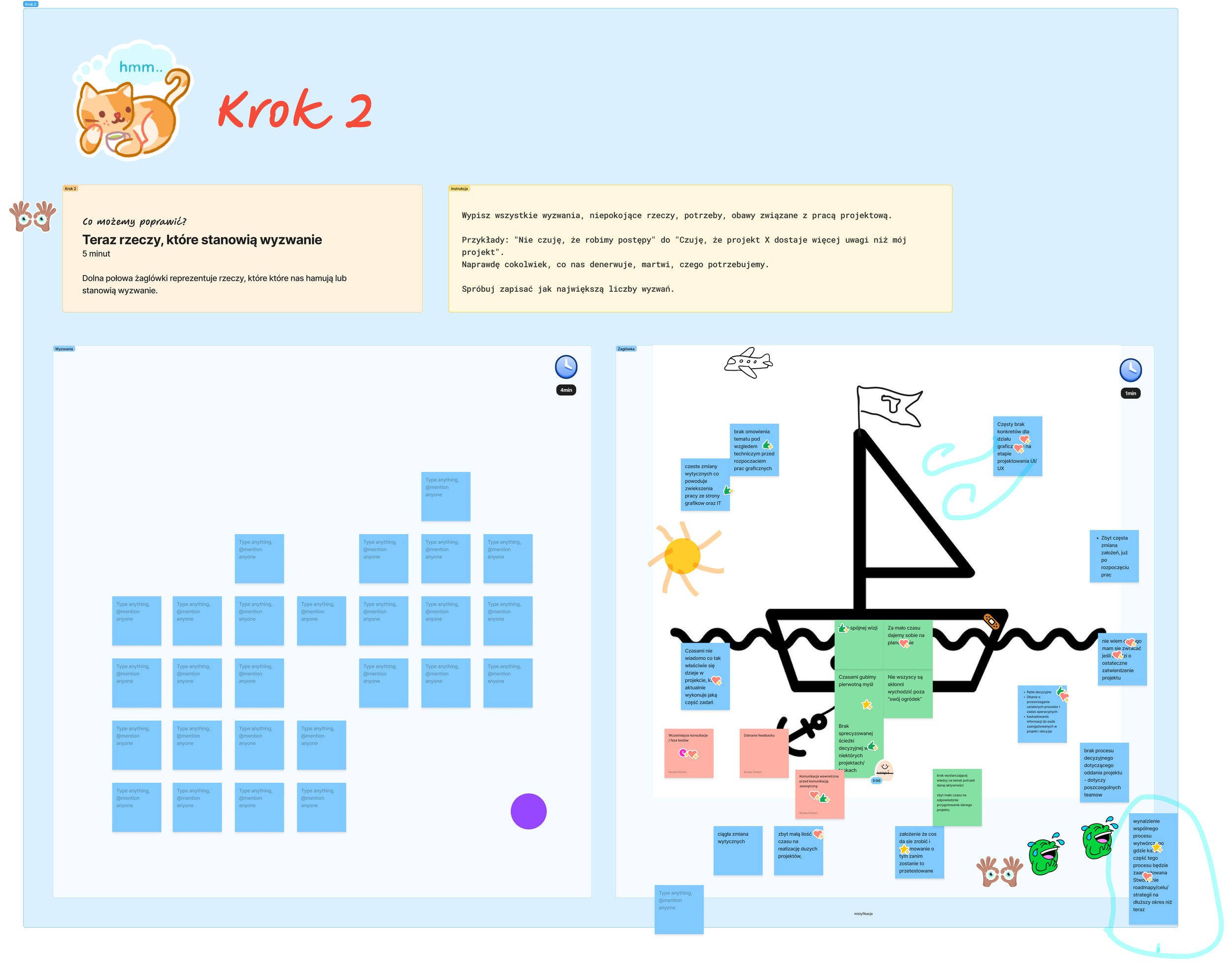
As being solely responsible for the process of redesign the platform, I firstly organized and conducted Lightning Decision Jam workshop brought together combined teams from Operations, IT, UI, and Analysis with the goal of preventing silos from forming early in the project.
By using FigJam collaborative whiteboard, the teams aimed to break down traditional barriers and enhance cross-functional communication from the start.
At the beginning of the workshop I asked participants to draw a sailboat on our FigJam board, divided by a waterline—the sail side for positives driving us forward, the anchor side for problems holding us back
Participants silently wrote positives on square sticky notes (4 minutes total, 1-2 min sharing each), then problems (one per note, posted all at once). This kept it collaborative and blame-free.
We identified five top problems holding back our e-commerce platform redesign, reframed as "How Might We..." opportunities for better user onboarding and CMS integration.
From 25+ solution ideas, dot-voting and effort/impact plotting prioritized five "do now" tasks—like streamlining checkout flows—which were assigned to the owners and deadlines.
Lessons learnt
This experience highlights that while technique like Lightning Decision Jam empower collaboration, thoughtful facilitation and ensuring all participants are on the same page about the process are critical to truly overcoming silo effects. The story serves as a valuable lesson on the importance of not just the tools but also the culture and mindset necessary to fully break down silos in cross-functional projects. However, not all team members fully grasped the collaborative nature and intended process of the workshop. Despite my strong intentions to avoid silos, the lack of full engagement and clarity in communication resulted in some information and workflow barriers persisting, undermining the workshop's initial goals.
Defining moodboard and design requirements
During the next workshop that I organized, were defining the moodboard and design requirements to guide the visual direction of the new platform. Stakeholders emphasized that the design should be elegant, clean, and simple, reflecting a professional and modern aesthetic.
We agreed on an aesthetic approach that prioritizes minimalism, balanced white space, and a subtle color palette to create a calm and refined user experience. I recommended the use of high-quality, authentic photos —preferably with natural lighting and neutral tones—to enhance the sense of elegance without overwhelming the design. The moodboard serves as a visual reference to ensure design consistency and alignment with stakeholder expectations throughout the project.
As a result a professional photo session with models was organized to effectively highlight the quality and appeal of the products on the platform, enhancing the visual presentation and customer engagement.
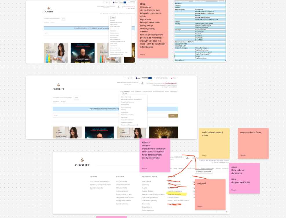
Information Architecture Workshop
I conducted an Information Architecture workshop with the Marketing and Operations teams to address the need for redesigning the existing structure of a platform. The session focused on identifying navigation pain points, aligning content priorities, and mapping user journeys across key touchpoints. Through collaborative card sorting and discussion, we defined clearer content categories and improved the hierarchy to support both user and business needs. The outcomes included a proposed IA framework and actionable next steps for validation and implementation.
Final Designs
Key story elements about the redesign and shopping experience:
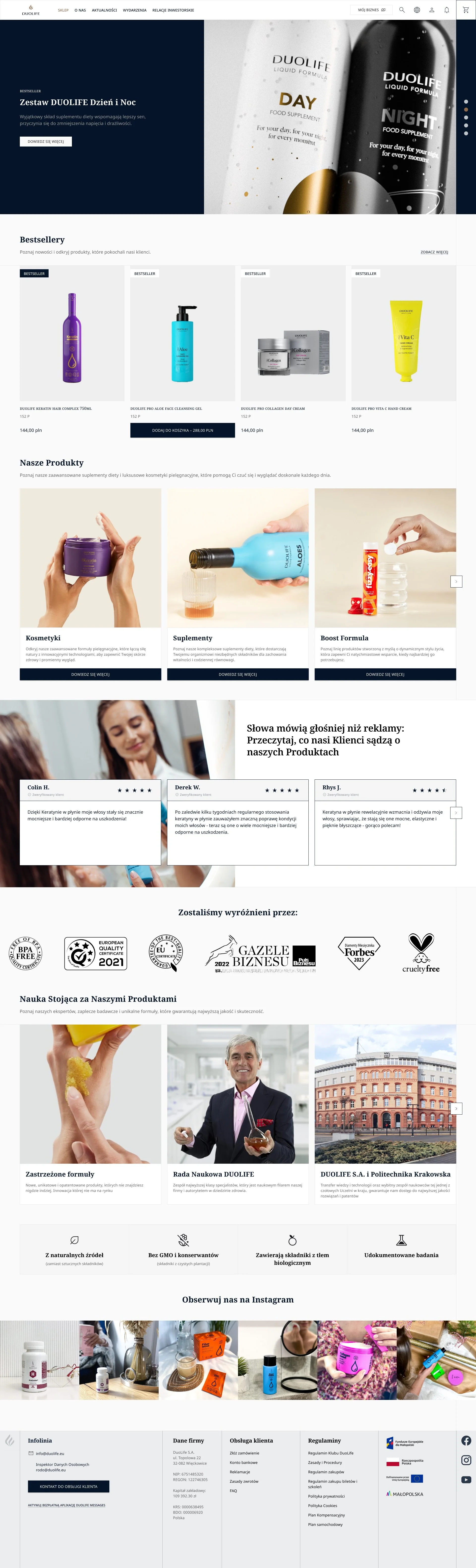
The new DUOLIFE platform is part of a full company transformation focused on simplification and innovation. This new chapter aims to make every interaction with the brand more seamless and enjoyable for users, from browsing products to completing purchases.
A dedicated design system was created in Figma to streamline the design process and ensure consistency across the entire platform.
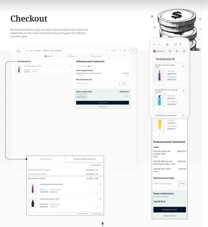
Shopping has been simplified with optimizations such as streamlined combined orders, faster payment processes, and clearer terms for adding products to orders. These changes reduce friction and speed updelivery times for customers.
The website’s user interface is now more accessible and visually appealing, highlighting DUOLIFE’s high-quality, expert-formulated supplements and skincare products. These improvements reflect the brand’s commitment to health, natural ingredients, and sophisticated presentation.
DUOLIFE's new platform supports ease of use for both new and returning customers, with product information organized clearly and navigation designed to reduce complexity, supporting a faster, more confident purchase journey.
The redesign incorporates modern e-commerce best practices such as user-friendly shopping carts, quick order modifications, and transparent policies that foster trust and brand loyalty.
In summary, the redesigned DUOLIFE website marks a fresh start that significantly enhances the customer experience through simplified shopping processes, clear and engaging presentation of wellness products, and a smoother journey from product discovery to purchase. This aligns perfectly with DUOLIFE’s mission of promoting health and wellbeing with innovative, natural solutions.
The DUOLIFE website redesign is a remarkable evolution from its prior non-user-friendly platform, now offering a sleek, modern, and highly accessible experience for customers. The transformation was driven by the goal of simplifying interactions and enhancing the overall user journey, particularly the shopping experience. Customers can now enjoy a streamlined process for browsing and purchasing DUOLIFE’s innovative dietary supplements and skincare products, with a more intuitive catalog, combined order options, and faster checkout, which reduces friction and boosts satisfaction.
Club Member Dashboard
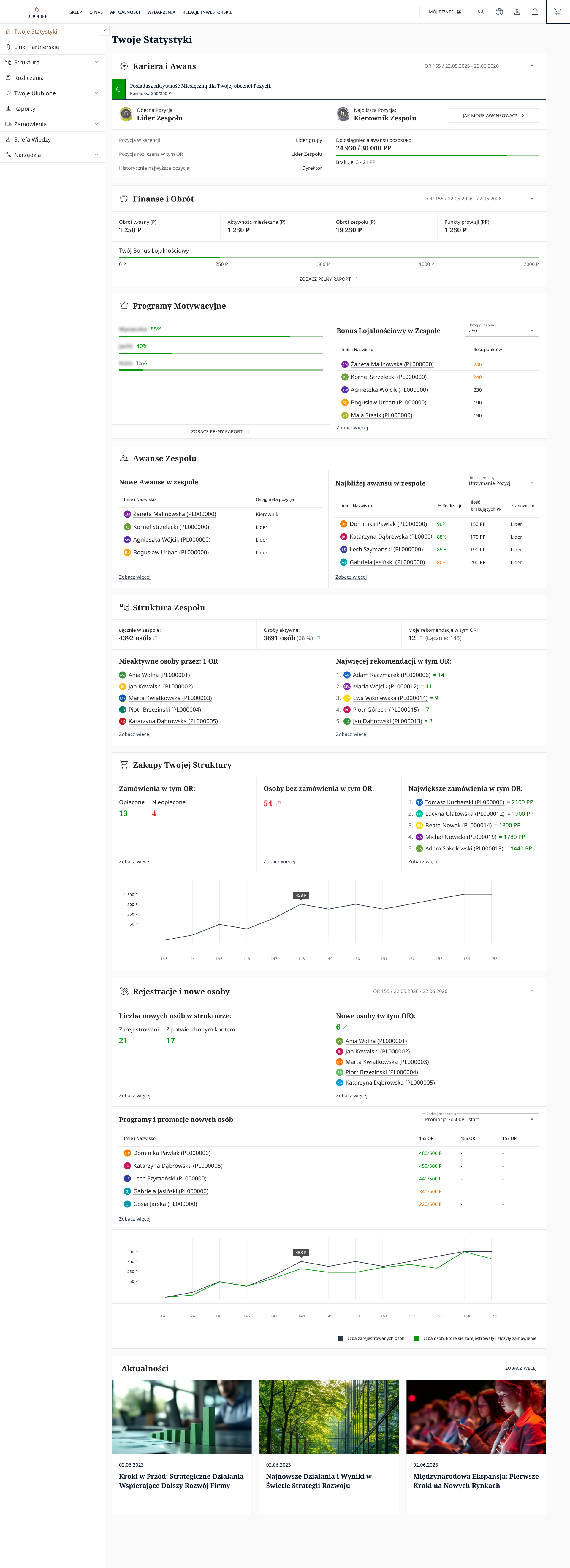
Significant part of the project included designing a Club Member Zone that presented statistics and performance metrics related to both the member’s activity and their network structure.
The goal was to give club users a clear, data-rich overview of their business activity in one place. It combines career progress, financial results, team structure, motivation programs, purchases, registrations, and news into a single interface, making it easy to track both personal performance and wider organizational activity.
What it shows
The dashboard is organized into modular sections, each focused on a different aspect of performance. Users can see their current position, progress toward the next rank, monthly activity, team turnover, commission points, and loyalty bonuses. It also highlights team progress, active members, new registrations, and the most important orders, which supports quick decision-making and monitoring.
Design strengths
The layout uses a dense but structured information hierarchy, which is appropriate for a power-user dashboard where users need access to many metrics at once. Card-based sections, clear labels, progress bars, rankings, and small charts help break down complex data into readable chunks. The visual style feels clean and functional, with plenty of whitespace and a consistent grid that keeps the interface organized despite the large amount of content.
User value
From a UX perspective, this type of dashboard helps users understand how their sales and team activity connect to their growth and rewards. It supports both status monitoring and action taking, since users can review performance, identify gaps, and track what they need to do to move forward. The combination of metrics, rankings, and trend charts makes the experience feel informative and goal-oriented rather than purely administrative.
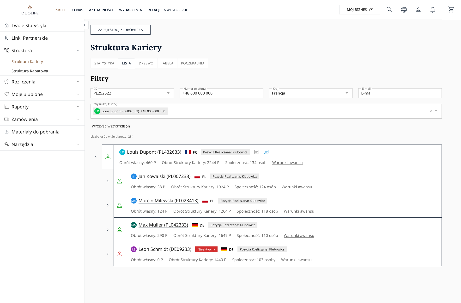
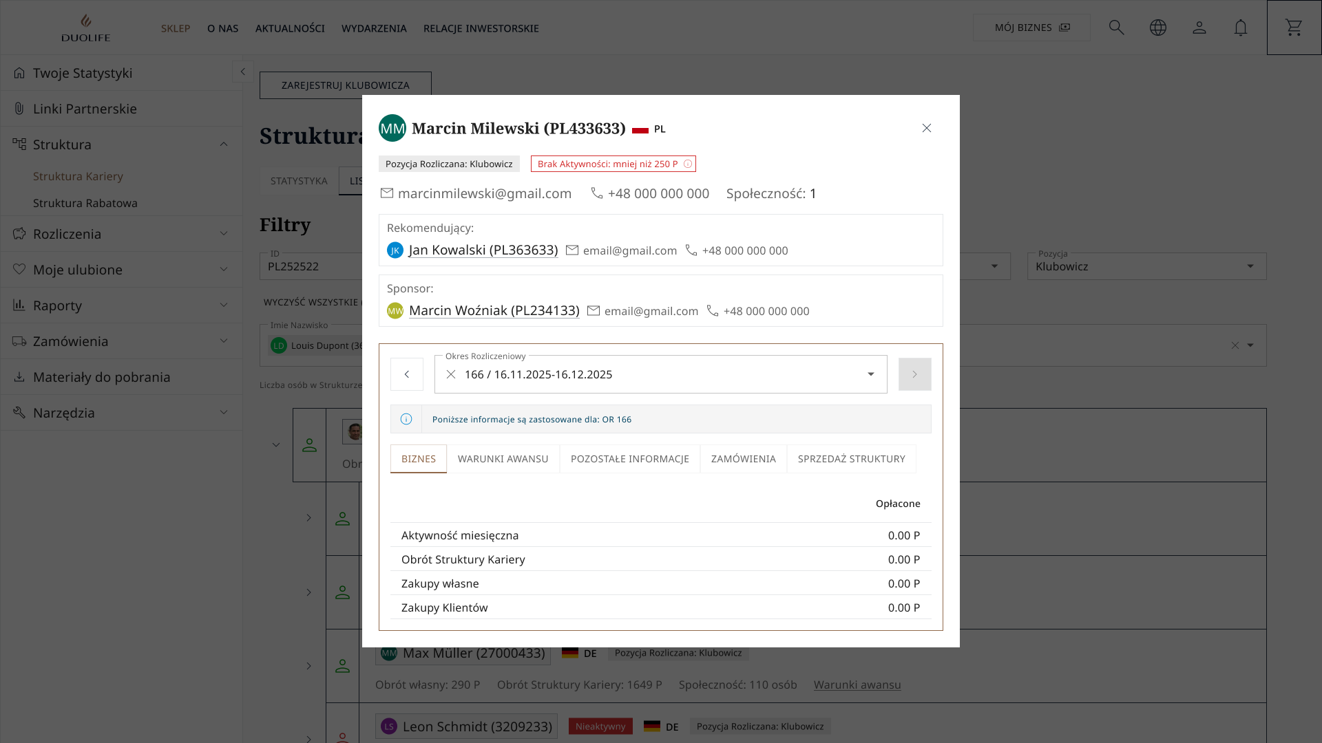
Detailed information
One of the most important elements of Club Member Zone is Career Structure area. The main view helps users browse and analyze the hierarchy of club members, while the modal provides deeper detail for a selected person. Together, they support monitoring performance, relationship structure, and progression within the network.
Main screen
The first screen works as an overview and exploration tool. It combines navigation, filters, and a ranked list of members in one workspace, which makes it easier to scan activity and compare people. The hierarchy information is shown with key metrics such as turnover, community size, and advancement conditions, so users can evaluate both performance and structure at a glance.
Detail modal
The second screen adds depth without leaving the main page, which is a strong UX pattern for data-heavy products. It reveals personal information, sponsor/recommender relationships, and period-based business metrics in a focused overlay. The tabbed structure helps separate business data, advancement conditions, orders, and additional information, reducing clutter while keeping the data accessible.
Ongoing gaps
Despite all those implemented features the platform still lacks some other important elements like advanced filters, adding favorite baskets, notifications for logged-in users, user-friendly emails, subscription feature and redesign of a CMS platform for e-commerce to be more user friendly.
These missing capabilities hinder user retention and personalization, as identified in post-workshop feedback from our UX research sessions.