Idium.no, now operating as Hjemmesidehuset, undertook a transformative redesign of their legacy website builder to better meet the evolving needs of modern users. The primary goal was to deliver a more user-friendly, mobile-first content management system (CMS) that embraced simplicity without sacrificing powerful functionality. At the heart of this new platform lies a WYSIWYG (What You See Is What You Get) editing experience, allowing users to visually design and manage their websites in real time without technical barriers.
User Testing
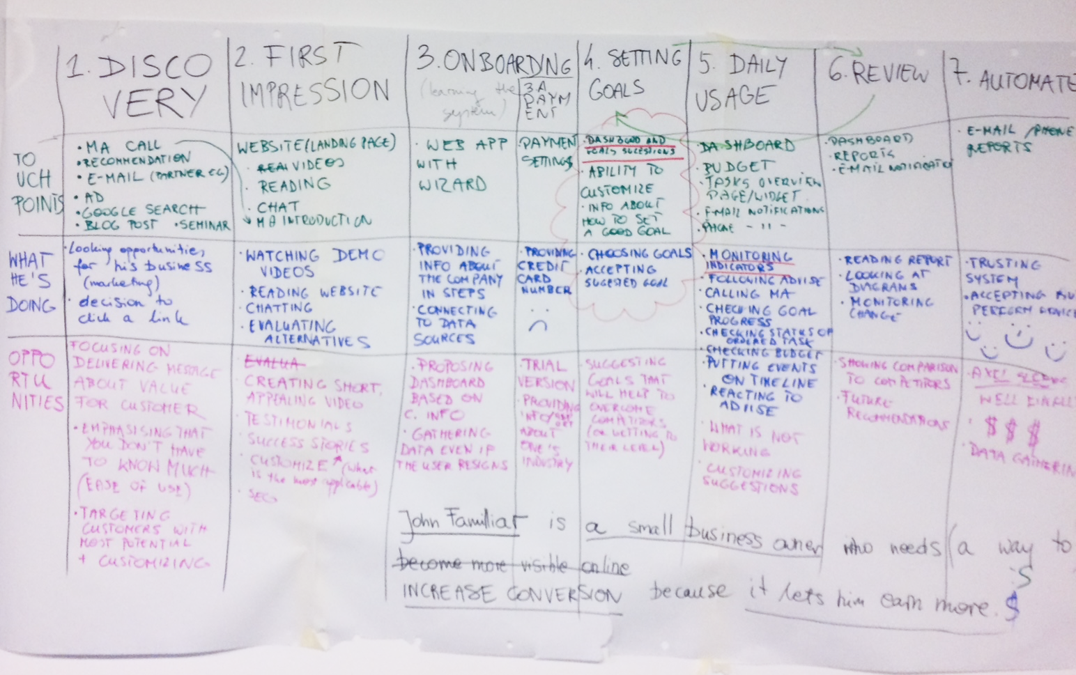
Over the course of two years, I co-conducted user testing sessions with more than 40 users, IDIUM’s clients from SME sector. This was a critical component driving design decisions. Tests took place on-site in Norway, as well as online from Poland, leveraging face-to-face interactions to gather rich qualitative insights into user behavior and pain points.
After each major release, I continued tests, enabling ongoing validation of new features. This rigorous testing regimen ensured the platform remained intuitive, accessible, and highly responsive across desktop, tablet, and mobile devices.
Design Sprint
At the beginning I was a part of a highly focused 5-day Design Sprint that brought together developers, stakeholders, product managers, and UX designers to align on the project vision and scope. The Sprint consisted of all five steps: Ideate, Decide, Prototype and Validate.
This collaborative sprint catalyzed a shared understanding of user needs and set a clear roadmap for incremental development. At the end of this stage, I co-designed the prototype of the MVP later tested with current customers.
CMS
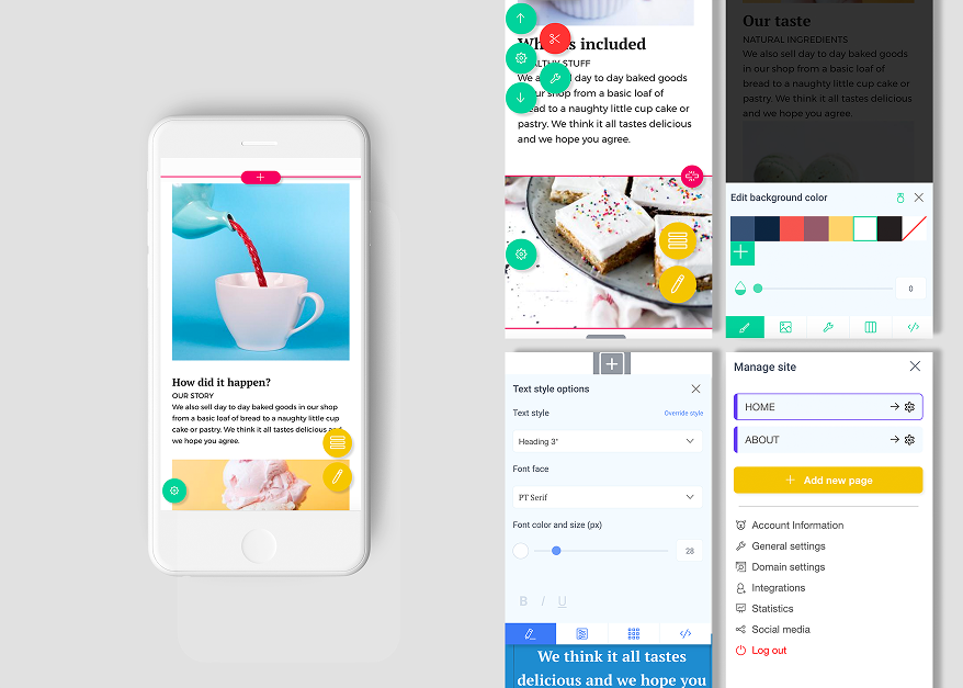
During development, the WYSIWYG architecture focused on real-time visual updates, drag-and-drop components, and inline editing, enabling users to craft professional, SEO-optimized websites with ease.
The CMS supported essential functionalities including multi-page layouts, customizable menus, integrated contact forms, and seamless incorporation of multimedia content—all optimized for responsiveness on all devices.
The need for this solution emerged during user testing, where it became clear that the website owner required a flexible platform allowing quick content updates — such as changing photos or promotional texts — while working on-site, for example when doing gardening or carpeting projects to showcase and promote their work.
Workflow
I collaborated closely with developers, product managers, and stakeholders throughout the project lifecycle. This deep cross-disciplinary partnership was crucial for balancing technical feasibility with user experience goals.
By actively participating in sprint ceremonies, design critiques, and user testing sessions, I helped ensure the platform’s user interface was not only visually appealing but also functional and intuitive for small and medium-sized businesses.
Onboarding
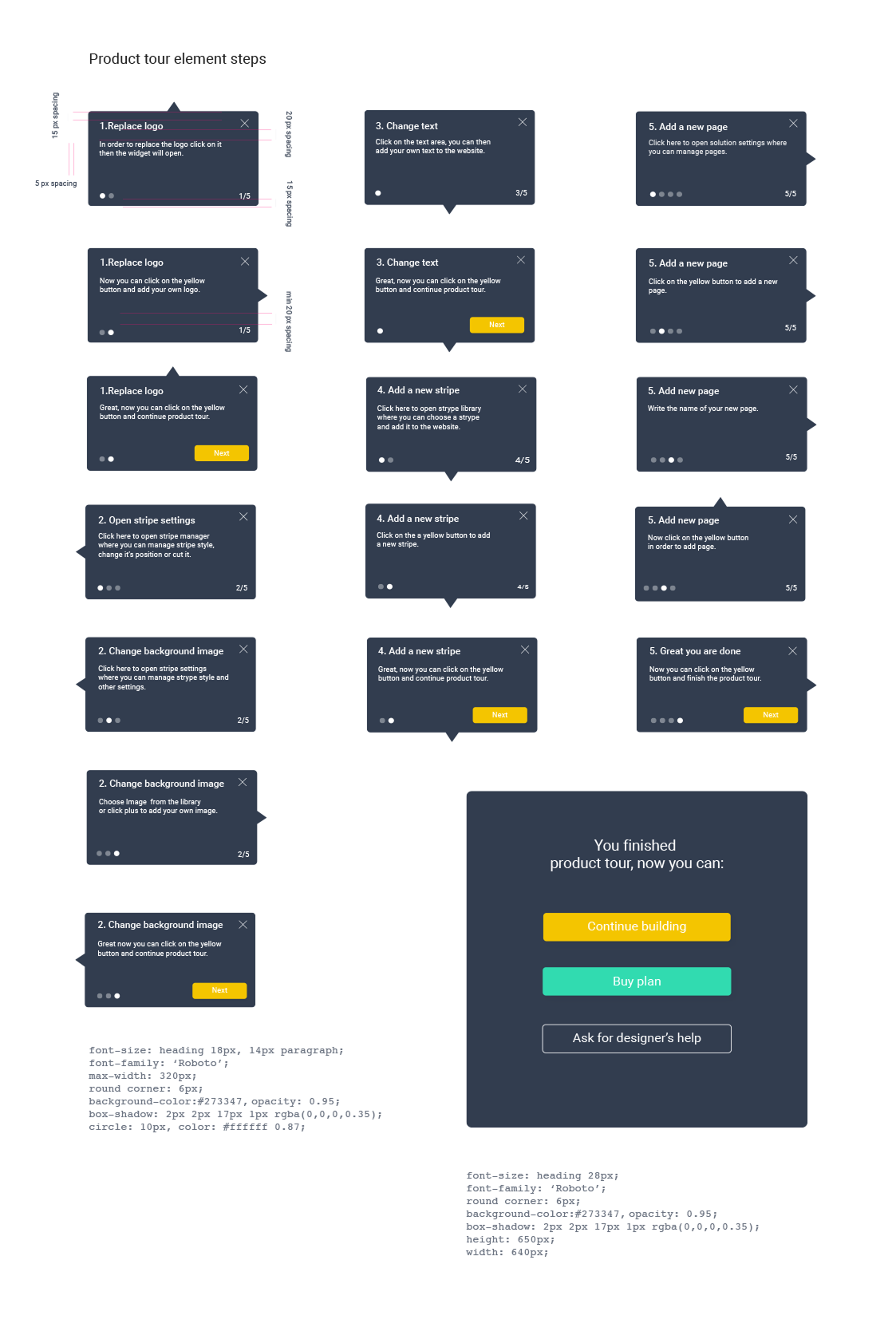
A final, but nevertheless crucial phase of the project was designing an in-context onboarding solution, as well as support/help pages.
This onboarding screen guides current and new customers through key setup steps for their website editor, such as replacing a logo, changing text and images, adding new sections, and creating pages. Each step is displayed in a clear, interactive tooltip, helping users learn essential actions with simple instructions and progress indicators. At the end, users are congratulated and prompted to continue building, explore plans, or get design help, ensuring a supportive and user-friendly first experience.
The Result
The Result
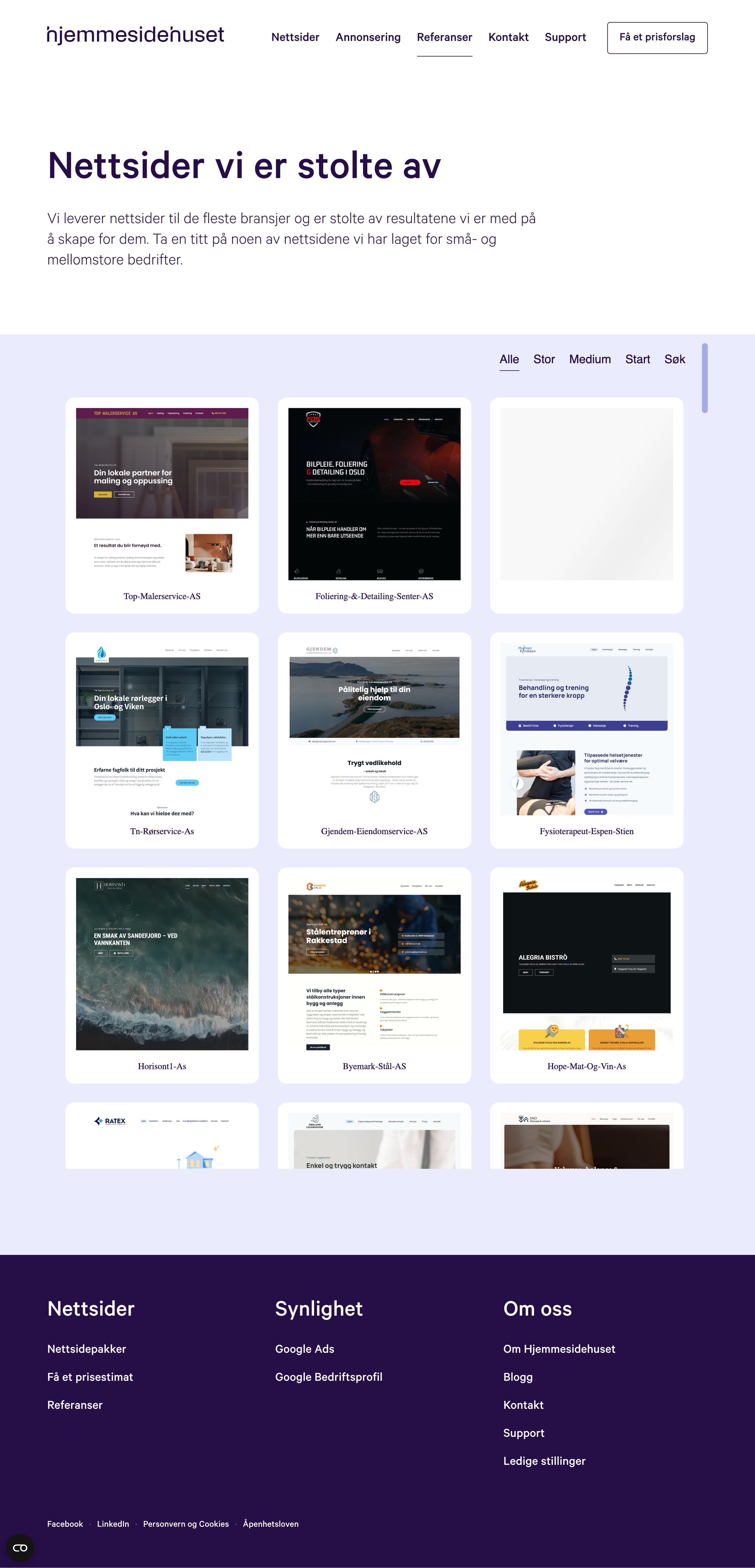
The result is a modern, scalable CMS solution that sustains Hjemmesidehuset’s position as Norway’s largest website provider for SMEs. The platform empowers business owners to manage their online presence confidently, supports responsive design out of the box, and integrates digital marketing tools—including Google Ads and Business Profile setups—to boost visibility in search engines.